The Quality - Cost Connection: Reporting organizational performance graphically
Reporting organizational performance graphically
Which chart type should you use?
By Patrice Spath, RHIT
Brown-Spath & Associates
Forest Grove, OR
To enable senior leaders to gain knowledge about quality and safety performance within the organization the quality department should create a concise, yet complete, measurement report.
A balanced scorecard approach is often used to get the full picture of the health of an organization. An advantage of the balanced score card approach over the single aggregate measure is that individual measurement results can be seen. The balance scorecard has been likened to an airplane cockpit. Rather than giving pilots just one "trouble light" (the plane is either OK or not OK), a bank of gauges is supplied so that the pilot may see trends and where any trouble is developing. Certain alarm values exist to draw the pilot's attention when problems arise. Similarly, the balanced scorecard provides an overview of organization performance. "Alarm" levels can be built in through established targets or statistically defined control limits.
There are many types of graphic data displays that can be used to present performance measurement results and there are a few universal rules about which type of graph best portrays any given set of data. You are likely to find that, in many cases, the same data set can be shown many different ways. The hard part is determining which type of graph best supports the information needs of the board and senior leaders in the organization.
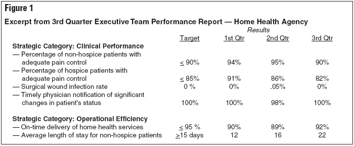
A table format is the simplest and least graphic of all data displays. Information is arranged in rows and columns. An excerpt from a table format report of high-level performance measures at a home health agency is found in Figure 1. Some balanced scorecard reports use a table format such as this. Whenever possible, report comparative data from other organizations along with your actual performance results. This adds another dimension to the report.
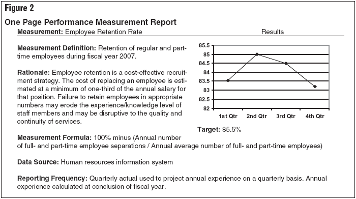
Some organizations use a combination of graphic and statistical reports of high-level measures. In Figure 2 is a one-page performance measurement report that provides significant detail about the measurement, including the measurement definition, rationale for monitoring this topic, the organization's target performance, the formula used to create the measure, the data source, and frequency of reporting. A line graph is used to report the actual results. This one-page per measurement format can be especially useful when an organization first begins to report performance measurement data to the governing board and senior leadership and physician groups. Because a full or half page is devoted to each measure, many of the common questions can be addressed upfront. As people become more familiar with the measures, some of the explanatory notes can be eliminated and the format condensed. However, be careful not to abbreviate the report so much that it no longer provides sufficient detail.
Dashboards are another commonly used format for reporting high-level performance measures. They serve the same function as reports presented in a table format; however, symbols and/or colors are used to draw people's attention to performance concerns. A dashboard report, using star symbols, is shown in Figure 3. A key to understanding the meaning of the "stars" used to report results is provided at the bottom of the report. The actual report is printed in color with the stars being reported in different colors. Not only can governing board members and senior leaders quickly see how well the organization is doing by counting the stars, they can also judge results by the color-coding.
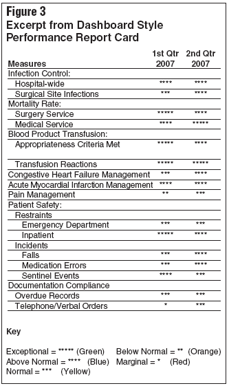
Creating a scorecard that relies on symbols and/or color to denote performance results requires some behind-the-scenes decisions. People must decide on the numeric levels that equate to the performance ratings. For example, what is an "Exceptional" nosocomial infection rate vs. one that falls into the "Normal" category? This decision should be made each year on a measurement by measurement basis with input from appropriate departments and physician groups. During this review, the numeric values that correspond to the performance ratings are revisited and revised as necessary.
For instance, to receive a five-star rating for pain management staff members must do well at assessing, treating, and educating patients about pain. If performance is two or more standard deviations above mean performance it is consider exceptional. An "above normal" rating is one to two standard deviations from the mean. The lowest rating is "marginal," which is performance that falls two standard deviations below the mean.
The senior leadership team, with input from medical staff leaders, must determine which key measures will be used to evaluate the organization's performance. It is up to the quality department to facilitate reporting of the results using a format that is easily understood and actionable.
To enable senior leaders to gain knowledge about quality and safety performance within the organization the quality department should create a concise, yet complete, measurement report.Subscribe Now for Access
You have reached your article limit for the month. We hope you found our articles both enjoyable and insightful. For information on new subscriptions, product trials, alternative billing arrangements or group and site discounts please call 800-688-2421. We look forward to having you as a long-term member of the Relias Media community.