The Quality-Cost Connection: Use XmR charts to better understand performance
The Quality-Cost Connection
Use XmR charts to better understand performance
Part 2 of a 2-part series: A guide to individual and moving range charts
By Patrice Spath, RHIT
Brown-Spath Associates, Forest Grove, OR
When people don’t understand what is causing variation in performance measure data, many things can happen:
- Trends are identified when there are no trends.
- Trends are not identified when there are trends.
- People blame or credit others for things over which others have no control.
- Past performance can’t be understood.
- Future plans can’t be made.
By plotting performance measurement data on control charts, quality management professionals can help prevent people from misinterpreting results. There are several types of control charts. However, one that can be used for many of the performance measures commonly used in health care organizations is the individual (X) and moving range (mR) chart. Commonly referred to as the XmR chart, this type of control chart can be used to plot both measurement and count data, making it appropriate to use in most situations.
Setting up the chart
As with all control charts, average values are determined, control limits are established based on +/- 3 standard deviations from the process average, and points are plotted and examined for signals of an out-of-control process. The XmR chart has two sections: a moving range control chart and an individual values control chart. The data in the table below show the weekly number of incomplete medication orders received by the hospital pharmacy department that cannot be filled without clarification.
| Weekly Number of Incomplete Orders | ||
|
# Incomplete |
Moving Range |
|
|
Week 1 |
||
Week 2
Source: Patrice Spath, Brown-Spath & Associates,
Forest Grove, OR.
The following steps are used to create a moving range chart from the data:
- Calculate the average moving range using the following formula:
Average MR = å MR + (n-1) = 18 + 9 = 2
- At the value of 2 on the Y axis
of the moving range chart,
draw a horizontal line. This
represents the average moving
range or the center line (CL).
- Calculate the upper control
limit (UCL) for the moving
range chart using the following formula:
UCL = 3.26 x Average MR = 3.26 x 2 = 6.52
Note: 3.26 is always the multiplier for R for the individual moving range chart.
- At the value of 6.52 on the Y-axis of the moving range chart, draw a horizontal line. This represents the upper control limit.
- The lower control limit for the moving range chart will always be "0". (Differences between values can’t be smaller than "0".)
Before calculating the values for and plotting the individual values chart, first interpret the moving range chart. Look for differences — changes from week to week — that exceed the three standard deviation control limit and thus signal a "special cause" variation. A completed moving range for the data illustrated in the "Weekly Number" table is shown in the "Moving Range Control Chart."
|
Moving Range Control Chart: Incomplete Medication Orders |
|
|
|
Source: Patrice Spath, Brown-Spath & Associates, Forest Grove, OR. |
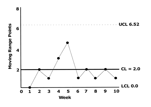
If the upper control limit is exceeded in any week, ask the people involved in the process to reflect on what was different that week. Understanding what caused the process to become unstable should lead to elimination or correction of undesirable influences. Next, the individual values chart is created using these steps:
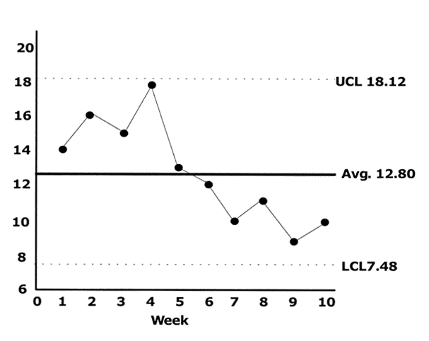
- Calculate the average number of incomplete medication orders for the time period using the following formula:
Average = sum of data points + number of subgroups
X-bar = å X + N = 128 + 10 = 12.8
- Draw a horizontal line at a value of 12.8 on the Y-axis of the individual values chart. This represents the individual values average and is the center line (CL) on the chart.
- Calculate the upper control limit for the upper control limit (UCL) for the individual values chart using the following formula:
UCL = average number of incomplete orders (2.66 x the average range)
12.8 + (2.66 x 2) = 12.8 + 5.32 = 18.12
Note: 2.66 is always the multiplier of the individual values chart for calculating the upper and lower control limits.
- At the value of 18.12 on the Y-axis of the individual values chart, draw a horizontal line and label it
UCL.
- Calculate the lower control limit (LCL) for the individual values chart using the following formula:
LCL = average number of incomplete orders (2.66 x average range)
12.8 (2.66 x 2) = 12.8 5.32 = 7.48
- At the value of 7.48 on the Y-axis of the individual values chart, draw a horizontal line and label it
LCL.
- Plot the weekly count data on the chart (see completed chart).
| Individual Control Chart: Incomplete Medication Orders |
|
|
| Numbers on left indicate incomplete medication orders. |
| Source: Patrice Spath, Brown-Spath & Associates, Forest Grove, OR. |
Interpreting the chart
Now it’s time to interpret the set of graphs that comprise the XmR chart. As noted, the differences in the ranges are examined first. This is done because the average range is used to determine the control limits for the chart. If one or more ranges is out of control, the reasons for the unstable process should be identified and eliminated (if possible) before the individual values chart has any meaning.
Once the change in the weekly number of incomplete medication orders consistently falls within the upper and lower control limits, then the process is considered to be in control. The values displayed on the individual values chart then can be used to reliably track the performance of the process. The data points on the individual values chart that fall within the upper and lower control limits can be assessed using statistical methods. When the measurement results are plotted, observe the values in relation to the center (median) line.
Eight consecutive points above or eight consecutive points below the center line signal the presence of a special cause that is forcing a shift in level. Six consecutive points, each of which is larger (or each of which is smaller) than its preceding point, are the statistical signal of a trend.
Identify, eliminate the problem
When signals of special causes are identified, the process owners need to get involved in eliminating the problem. When no signals of special causes exist, the process is operating at its best. If further improvements are desired, fundamental changes in the process will be necessary. People who understand variation can see from the XmR chart that the process of medication order writing is a controlled process. However, it may not be operating at a level that is satisfactory to everyone.
Without significant changes to the process, the number of incomplete orders received by the pharmacy will likely continue to range from a low of nine to a high of 18 each week. To further reduce variation in the process, the underlying system of how orders are written must be improved.
Recommended reading
• Kelley, D. Lynn. How to Use Control Charts for Healthcare. Milwaukee: American Society for Quality; 1999. Telephone: (800) 248-1946. Web site: www.asq.org.
• Carey R.G, Lloyd R.C. Measuring Quality Improvement in Healthcare: A Guide to Statistical Process Control Applications. Milwaukee: American Society for Quality; 2001. Telephone: (800) 248-1946. Web site: www.asq.org.
• Wheeler D. Understanding Variation: The Key to Managing Chaos. Knoxville, TN: SPC Press Inc.; 1993. Telephone: (800) 545-8602. Web site: www.spcpress.com.
Subscribe Now for Access
You have reached your article limit for the month. We hope you found our articles both enjoyable and insightful. For information on new subscriptions, product trials, alternative billing arrangements or group and site discounts please call 800-688-2421. We look forward to having you as a long-term member of the Relias Media community.